Design for Open Source: phpMyAdmin Brand Refresh
🇧🇷 Se você está lendo isto, existe uma versão em português desse artigo!
This text has a wider audience: for Designers, developers, and the ecosystem around (Product Owners/Managers, QA, etc), so I’ll try to keep it the more explained and linked as possible.
And it’s my first try to finish the texts that have been living for years in my notes… 🤷
—
I was laid off at the beginning of the pandemic and had problems not having a portfolio with different projects. This happens because I worked most of the years in a few but big products, but that doesn’t make the expected volume in the portfolio. Every product in my portfolio was released, the ones that didn’t, stayed behind an NDA and cannot be shown outside of the company. Those projects are what make volume in a portfolio. Because of that, I realized that I had to do new cases.
Instead of following the standard to create hypothetical solutions (like most people do in Dribbble), I thought to myself:
“Why not solve real-life problems and, with that, solve some open source project problems?
So, I began started to search and during that search, Hacktoberfest started, which gave me the idea to search for open-source projects that really needed enhancements (from UI/UX people).
Strangely enough, is hard to find issues related to that problem (know about Github and issues here). Not that they don’t need it, but I believe that is not easy to find designers that are open to help them, and the developer, for the most part, doesn’t have that concern. So, no issues.
With that search, I found phpMyAdmin.
phpMyAdmin project
The PMA is an OpenSource software that aims to “manage MySQL/MariaDB databases over the web”
phpMyAdmin is a free software tool written in PHP, intended to handle the administration of MySQL over the Web.
It’s a big product, with decades of life (22 years, to be more exact), well know, and used. If you, as a designer, already created a WordPress website, you probably worked with.
Like all OpenSource project that doesn’t have a Big Tech with design in mind behind it, these projects are visibly lacking in UI/UX and many seem to have stopped in time, although the solution is useful and often used. This happens because it’s a product created by developers and these professionals, even do they care, don’t have the focus, study and mindset focused on interface design.
It is not a lack of will, it is a lack of repertory.
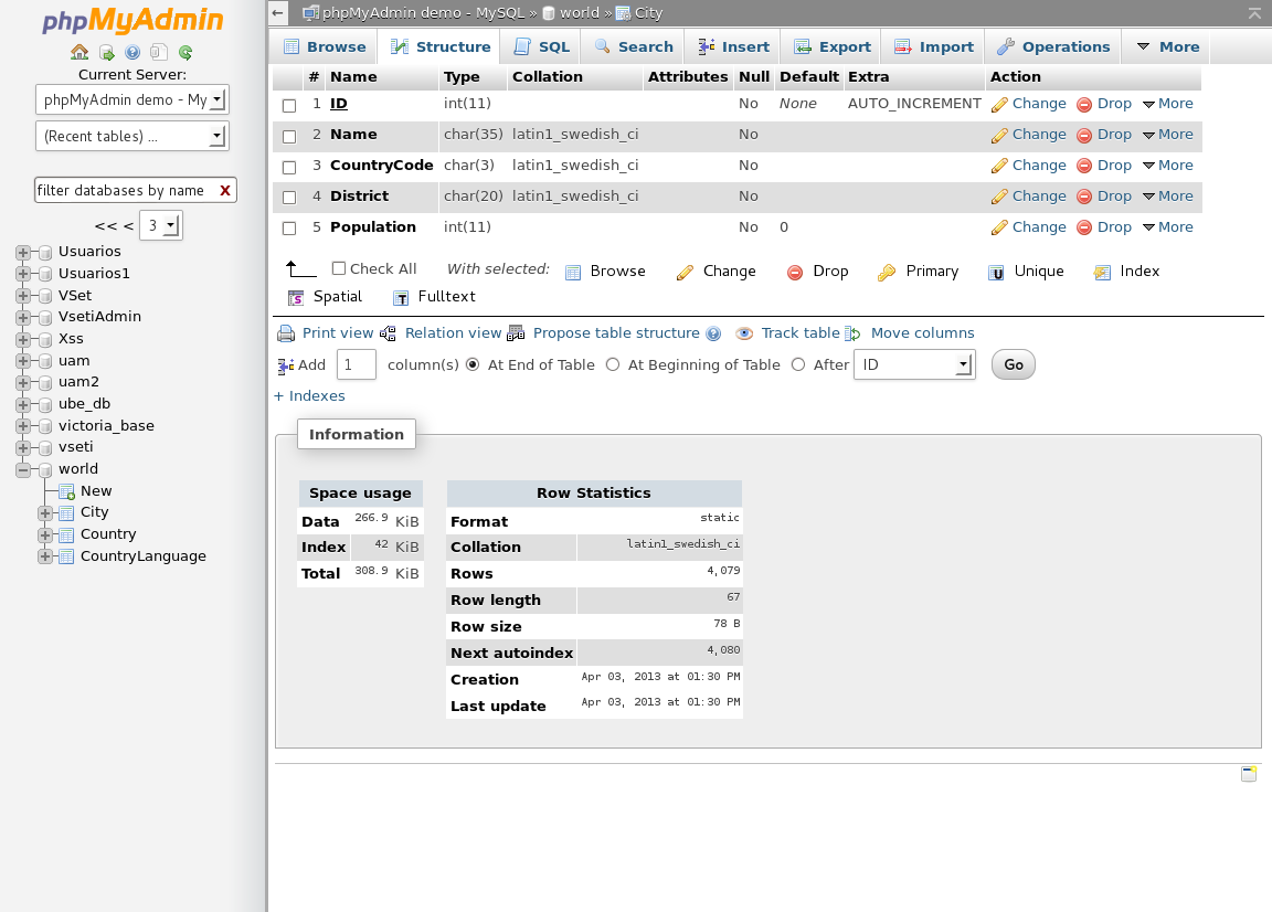
The Redesign
My first idea was to create a new interface for the product itself. But I realized that they just update the interface with some breaking changes and I evaluated the feasibility of a new non-essential breaking change it would be very risky for the project (and for the approval of the new UI) at that time.
Multiples breaking-changes in a non-essential feature (theme support) aren’t something that users tend to like.
On the search in other repositories on their organization, I found an issue from 2019 about the website’s visual, comparing with another OSS tool. As expected, isn’t visually attractive.

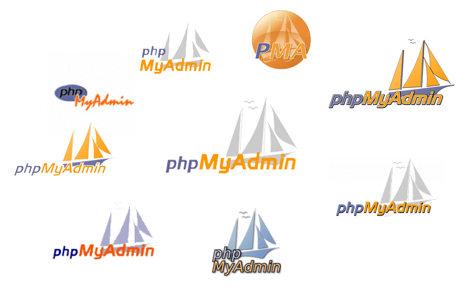
I did a study of the entire interface, but before going on that subject, I realized that their logo also didn’t have a standard, although the symbols and colors were frequent and well recognized.
So, since I was proposing an update to the look and feel of the website, why not modernize the brand too?
Modernizing the Brand
According to the creators/maintainers, the logo idea was to show how
“The phpMyAdmin helps the user to ‘sail in the turbulent seas’ of using MySQL”
At the time it was released (1998) it made perfect sense. If you weren’t on the internet at that time, look for those interfaces or ask for someone who lived it. It was a complex time for interfaces.
To better situate you in time: Facebook was released in 2004, MySpace in 2003. MSN Messenger in 1999. phpMyAdmin already existed.
The Brand
The blue color comes from PHP (base code language) and the orange color comes from the MySQL logo.

So, keep the sail, the idea of turbulent seas, and the colors. Those are the main aspects.
Although I have a Graphic Design background, the visual identity isn’t my specialty, but I have a pretty good understanding. Therefore, I know that a good brand must essentially have a symbol, good typography, and striking colors.
Their logo application on the internet (main platform) makes that the logo loses a lot of details because of the size. In addition to not being able to be reduced, having problems with placement on backgrounds other than white and when printing in B&W.
So, I decided that I would follow the KISS principle: Keep It Simple, Stupid. This is one of the pillars of Nielsen’s 10 Heuristics.
The logo should, at the same time, have the colors already recognized by the brand, continue to be recognized without the text, be simple to be placed in any media, and work even in monochrome printing.
The biggest problem was the lack of legibility: the sail was hard to see in clear backgrounds and/or when placed in small spaces. The yellow of the text on top of the gray didn’t help either (the Contrast Ratio scored 1.32:1, it didn’t even come close to the minimum — 4.5:1, although WCAG doesn’t ask for that in logos).
Symbol and Colors
To avoid the legibility problem, I removed the gray that was a support color and added two shades of blue, based on the brand’s blue. Simplified the sail using just 3 shapes to make placement on small spaces easier, as well as simplifying the wave in just one shape. The previous version of the logo had 5 shapes for the sail and 3 for the waves, beside the seagulls.
Here I also removed the need for the logo to always be the symbol + typography. Now the brand can be displayed easily with the symbol only.
As I did the base of the symbol in Figma, the curves were not exactly as I wanted, so I asked for the help of a friend that I met in university who knows much more of this area of Graphic Design/Visual Identity than I, although she is migrating to UX now: the competent Beatriz Fazolo. She fixed the curves and improved the visual spacing of the symbol, making it presentable.

Typography
The original brand typography was the same as the PHP brand, which not only doesn’t work with the new symbol, it’s a paid typography. And this doesn’t match with the idea of the project to be OpenSource.
Because of that, me and Beatriz had a basis that the typography should be OpenSource or, at least, free to use. After some tests, we arrived at Montserrat, which is an OpenSource typography (SIL-OFL 1.1) that lets you do private use, commercial use, modify and share, with the conditions to keep the original license and give the creator the credits. This license is similar to the original PMA license (GNU GPL 2.0 — that permits the same use but asks you to show what you changed and the new code), but for our use is essentially the same.
In addition to that, Bea gave a good differentiation on the “php” text with the regular typography and the “MyAdmin” in bold. This means that, if the print is monochromatic, the names will be highlighted differently, even with the same color.

Logo
Now we are in the final product: The complete Logo.
Besides the changes in symbol and typography, we also changed the layout of the elements, so that, in addition to the readability being better, the use can be split when necessary.


Conclusion and Comparison
The new Visual Identity proposal was well accepted by the phpMyAdmin teams and is just waiting for the merge (which because of the nature of Open Source projects and voluntary maintainers, can take some time).

You can find the presentation on Behance.
If you have or know any OpenSource project that is used by many people and need some design love, comment here!
—
The initial idea of this text was to put the whole redesign in one text, but as I was writing I realized that it was too extensive, so I decided to split it into more parts. I'll update this text as soon as I publish these parts.
